Phone:+16179821253
Address: 315 W 3rd St, Boston, Massachusetts, 02127, USA
Email: sloanecarter773@gmail.com
Phone:+16179821253
Address: 315 W 3rd St, Boston, Massachusetts, 02127, USA
Email: sloanecarter773@gmail.com

Our free online Violin Plot Maker lets you create publication-quality violin plots directly in your browser. Paste your numbers, choose a style, and get a downloadable chart with full statistics instantly. It uses Python and seaborn under the hood — the same library used by data scientists and researchers worldwide — so the output is always accurate and professional.
Nowadays, understanding how your data is distributed is crucial for making good decisions. Whether you are a student, researcher, or analyst, seeing the shape of your data reveals patterns that simple averages hide. You can visualize any dataset instantly by using our free Violin Plot Maker.
Our online violin plot Maker simplifies the process and eliminates the hassle of manual charting. This step-by-step guide will help you become familiar with the tool.
Select Single Variable Analysis for one dataset, or Compare Multiple Categories to compare groups side by side. If you just want to see how one set of numbers is distributed, choose Single Variable. If you want to compare test scores between classes or sales between regions, choose Compare Multiple Categories.
Paste values separated by commas — e.g. 12, 15, 18, 20, 25. For categories also add a label per number — e.g. Group A, Group A, Group B, Group B. You need at least 3 values, but violin plots work best with 15 or more data points.
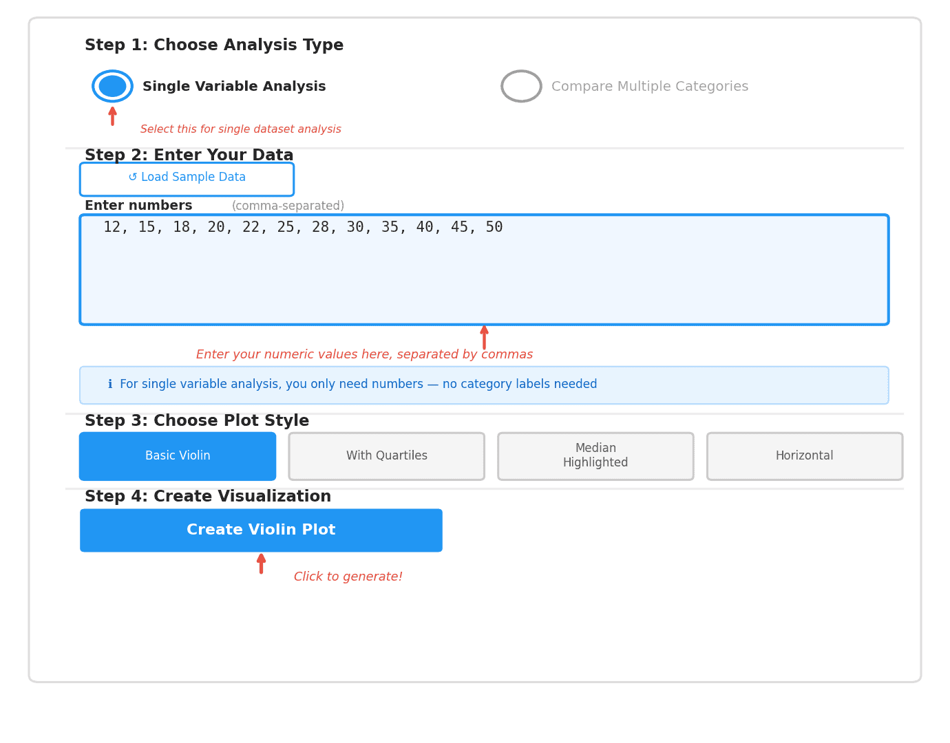
Single variable data entry
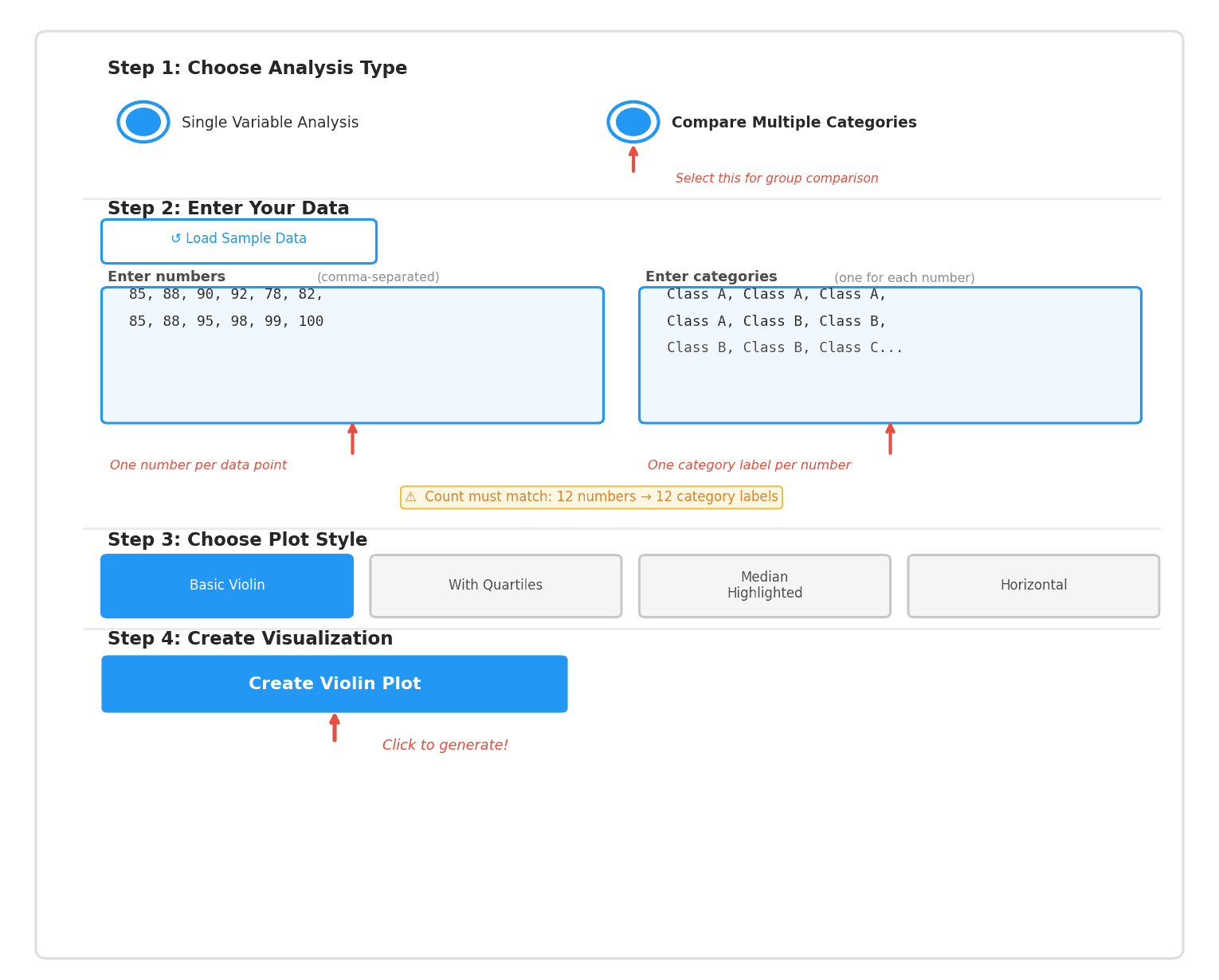
Category comparison data entry
Pick from Basic Violin, Violin with Quartiles, Median Highlighted, or Horizontal. Basic Violin is a great starting point for most use cases. Violin with Quartiles is best for research papers where you need to show Q1, median, and Q3 explicitly.
Your chart appears instantly with 8 statistics: count, min, max, mean, median, Q1, Q3, and standard deviation. Click Download PNG to save a 300 DPI image ready for reports and presentations.
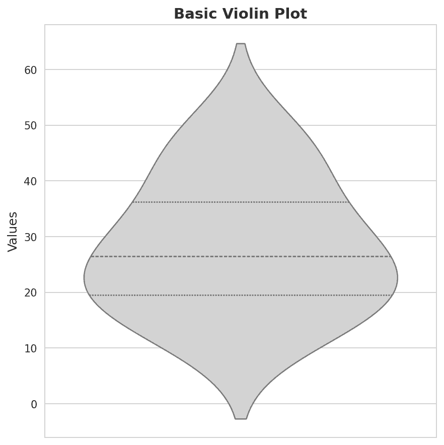
Basic Violin Plot result
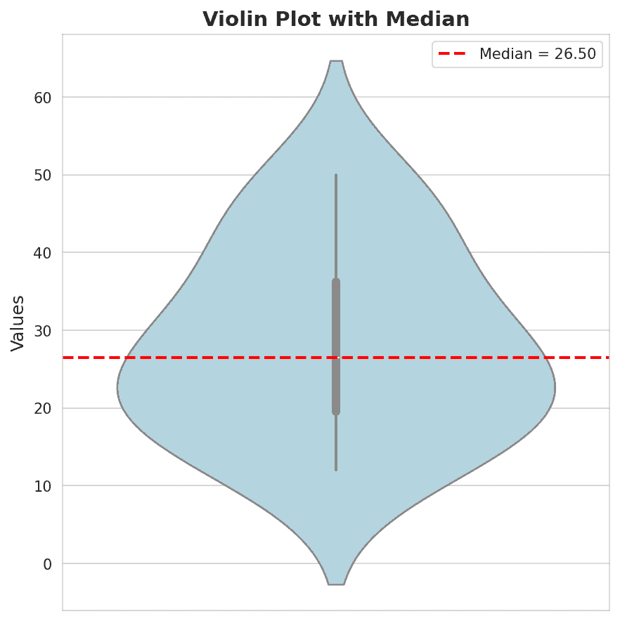
Median Highlighted result
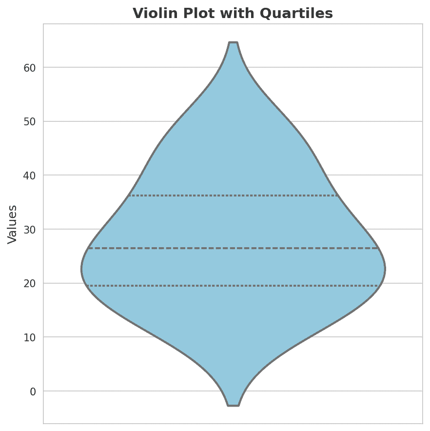
Violin with Quartiles result
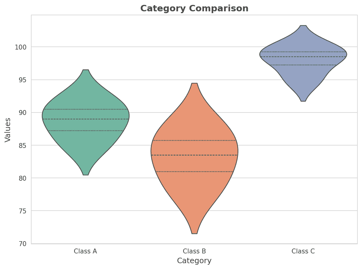
Category Comparison result
A violin plot is a statistical chart that shows the full distribution of a dataset. It combines a box plot (median and quartiles) with a kernel density estimate (where data is most concentrated). The result looks like a violin — wide where data clusters, narrow where data is sparse.
Unlike a bar chart or box plot, a violin plot reveals the complete shape of your data — whether it is symmetric, skewed, or has multiple peaks. This makes it one of the most informative charts available for understanding data distributions.
Shows distribution shape
Reveals data density
Shows median & quartiles
Detects bimodal data
Good for small datasets
Reading a violin plot is straightforward once you know what each part means. Start from the overall shape then look at the inner details.
Wide in the middle means data clusters around the center. Wide at top or bottom means data is skewed that way. Two bulges means two groups exist within the data.
The thickest center line is the median. The two outer dashed lines are Q1 (25th percentile) and Q3 (75th percentile). The space between them contains the middle 50% of your data.
The wider the violin at any point, the more data values exist there. Very wide at 25 and narrow at 50 means far more data points sit around the value 25.
The very top and bottom show max and min values. Very thin pointy tips suggest rare outliers. A rounded tip suggests values gradually trail off.
One wide bulge in the center. Data clusters around one main value. Common in heights, test scores, and natural measurements.
Two separate bulges. Data has two distinct groups. Example: exam scores where half the class prepared and half didn’t.
Wide at the bottom, narrow long tail at top. Most values are low with a few very high. Common in income and sales data.
Wide at top, narrow long tail at bottom. Most values are high with a few very low. Common in age-at-retirement data.
Violin plots work best when the shape of your data matters — not just the average
Violin plots are used across many fields where understanding the shape of data is important.
Comparing experimental results across treatment groups, visualizing student performance, and presenting findings in papers.
Comparing sales across regions, evaluating A/B test results, and analyzing customer segments or KPI distributions.
Comparing patient outcomes between treatments, visualizing clinical trial results, and supporting evidence-based decisions.
Exploratory data analysis, feature distribution visualization, and model performance comparison across datasets.
A violin plot is a statistical chart that combines a box plot and a kernel density estimate to show the full distribution of a dataset. The outer shape widens where data is concentrated and narrows where data is sparse. Unlike a bar chart or box plot that only shows averages or quartiles, a violin plot reveals the complete shape of your data, making it much easier to spot patterns, skews, and multiple peaks. You can create a free violin plot instantly using our Violin Plot Maker.
A violin plot looks like a symmetrical, mirrored shape — often resembling a violin or an hourglass. It is wider in areas where more data points exist and narrower where fewer values are present. Inside the violin you will typically see lines marking the median and quartiles (Q1 and Q3). The very tips represent the minimum and maximum values in the dataset.
A violin plot has five key elements:
(1) the outer shape, which is a mirrored kernel density curve showing where data is concentrated;
(2) the median line, which marks the 50th percentile;
(3) the Q1 and Q3 lines, which mark the 25th and 75th percentiles respectively;
(4) the whiskers, which show the full range from minimum to maximum; and
(5) the width at any given point, which represents how many data values exist at that level.
The density aspect of a violin plot refers to kernel density estimation — a statistical method that smooths out the raw data into a continuous curve showing probability density. The wider the violin at any height, the higher the density — meaning more data values exist at that point. This is what makes a violin plot more informative than a box plot, which only shows summary statistics without revealing the underlying density.
It is called a violin plot because when the kernel density curve is mirrored on both sides of a central axis, the resulting outline often resembles the body of a violin. The name was introduced when this chart type was first proposed by Hintze and Nelson in 1998. Not all violin plots look exactly like a violin — the shape depends entirely on your data distribution — but the name has stuck as the standard term.
The function of a violin plot is to display the full probability distribution of a dataset, not just summary statistics. It allows you to see the shape of your data — whether it is symmetric, skewed, bimodal, or has outliers — in a single visual. It combines the statistical precision of a box plot with the distributional insight of a density plot, making it one of the most information-rich charts available for exploratory data analysis and research presentations.
A box plot shows only five summary statistics: minimum, Q1, median, Q3, and maximum. A violin plot shows all of that plus the full distribution shape. The key difference is that a box plot hides the density of data within each quartile range, while a violin plot reveals it through the width of the shape. For example, if your data has two clusters (bimodal distribution), a box plot shows no sign of this — but a violin plot immediately shows two distinct bulges.
Yes, violin plots are very well suited for categorical data when each category has a continuous numerical measurement associated with it. For example, comparing test scores across different class groups, or sales revenue across different regions. Each category gets its own violin. What violin plots are not suited for is purely categorical data with no numerical component — for that, a bar chart is more appropriate.
Violin plots are best suited for continuous numerical data — data that can take any value within a range, such as heights, temperatures, scores, prices, or measurements. They work best when you have at least 15 to 20 data points per group. They are not suitable for very small datasets, purely categorical data, or when exact individual values are more important than the overall distribution shape.
The easiest way to create a violin plot is using our free Violin Plot Maker — just paste your numbers, choose a style, and download your chart in seconds with no coding required. For those who prefer coding, violin plots can be created in Python using seaborn or matplotlib, in R using ggplot2, or in MATLAB using the violinplot function. Our free tool uses Python and seaborn under the hood, so you get the same professional quality without writing a single line of code.
Excel does not have a native violin plot chart type. Microsoft Excel supports bar charts, pie charts, histograms, and box plots, but violin plots are not built in. The simplest solution is to use our free Violin Plot Maker, which generates a professional violin plot instantly that you can download as a 300 DPI PNG image and insert directly into your Excel file or report.
Excel does not support native violin plots, but there are two workarounds. The first option is to use our free Violin Plot Maker — enter your data, generate the violin plot, download the PNG image, and insert it into your Excel spreadsheet. The second option is using Excel’s built-in Python feature (available in Microsoft 365) to run seaborn code directly inside Excel. For most users the first option is far simpler.
In OriginPro, you can create a violin plot by selecting your data column, going to the Plot menu, choosing Statistical, and selecting Violin Plot. Origin offers extensive customization options. However, OriginPro is paid software starting at several hundred dollars per license. If you need a violin plot quickly without a software subscription, our free Violin Plot Maker creates the same professional result in seconds.
Yes, matplotlib has a built-in violin plot function called violinplot(). You can call it with ax.violinplot(data) or plt.violinplot(data) in Python. However, the seaborn library offers a more refined violinplot() function with better default styling, easier category comparison, and built-in quartile display. Our free Violin Plot Maker uses seaborn under the hood.
To create a violin plot from a CSV file in Python, first import pandas and seaborn, then load your CSV using pd.read_csv(‘filename.csv’), and pass the relevant column to sns.violinplot(). If you do not want to write Python code, our free Violin Plot Maker lets you paste your values directly and generates the same result instantly — no CSV file handling or coding required.
Adding individual data points to a violin plot — called a strip plot or swarm plot overlay — is possible in seaborn by combining violinplot() with stripplot() or swarmplot() on the same axes. This shows both the distribution shape and every individual data point simultaneously. This technique is particularly useful for small datasets where showing individual points adds transparency.
Violin plots can be created in several tools: Python (seaborn or matplotlib), R (ggplot2 with geom_violin), MATLAB, JMP, OriginPro, Prism, and Tableau. For data scientists and researchers, Python with seaborn is the most popular choice. For those who prefer no coding, our free Violin Plot Maker uses Python and seaborn behind the scenes and gives you a professional violin plot in seconds.
Yes — 100% free. No account, no registration, no payment. Just open the page, enter your data, and create your violin plot. There are no limits on how many times you can use it.
You need a minimum of 3 values, but violin plots work best with 15 or more. For group comparisons, aim for at least 15 values per group for a meaningful result.
Select Compare Multiple Categories in Step 1. Enter all your numbers first, then a category label for each number. For example: values 85, 90, 78, 95 with categories Class A, Class A, Class B, Class B.
Basic Violin is clean and simple. With Quartiles is best for research showing Q1, median, Q3. Median Highlighted is best when the median is the key number. Horizontal is useful for long category names.
No. Your data is only used to generate the chart and is never saved, logged, or shared. Once the plot is created the data is discarded immediately.
Yes. The PNG download is 300 DPI — publication quality. Use it freely in academic papers, reports, or presentations. No attribution required.
Yes. The tool is fully responsive and works on any screen size — phone, tablet, or desktop.
Just numbers separated by commas — for example: 12, 15, 18, 20, 25. Decimals work too: 1.5, 2.3, 4.7. No headers, no spreadsheets, no special formatting needed.
Yes, if you know R — the ggplot2 package uses geom_violin(), and packages
like ggpubr or rempsyc add publication-ready styling on top. Prefer not to
write code? Paste your numbers into the tool above and get the same chart
in seconds, no R installation required.
It works well for a quick look at group-level distributions — paste expression values and compare conditions instantly. For deep single-cell workflows (clustering, marker-gene identification across thousands of cells), a dedicated bioinformatics package built for that scale will serve you better. This tool is built for the fast general-purpose check, not full pipeline analysis.
Yes — most tools use Tukey’s Fences: values beyond 1.5× the interquartile range (IQR) count as mild outliers, beyond 3× IQR as extreme. Unlike a box plot, which only marks outliers as dots past the whiskers, a violin plot shows the full distribution shape too — so you can see how far into the tail those points actually sit, not just that they exist.
Seaborn’s sns.violinplot() handles it directly — pass your data and a column to y for a single violin, add x to group by category, or hue to split each violin by a subgroup. Prefer not to write code? Paste your numbers into the tool above for the same result without touching Python.
GraphPad Prism has built-in violin plots since version 8 — select your data table, choose the violin plot graph type, and Prism draws median/quartile lines automatically with adjustable smoothing. No Prism license or just need one chart quickly? Paste your numbers into the tool above instead.
A split violin plot cuts each violin in half to compare two subgroups side by side within the same category, instead of drawing four separate violins. Commonly built with seaborn’s split=True option in Python or the vioplot package in R.
Yes, if you have SPSS Statistics version 29 or later — violin plots were added as a Graphboard Template Chooser option. Older versions need a workaround (an IBM SPSS Modeler extension using Python/seaborn). Prefer not to deal with version requirements? Paste your numbers into the tool above instead.
Transform complex datasets into clear, interactive visualizations with Violin Plot. Start exploring data distributions in a way that empowers insight and drives smarter decisions.